Simplicity
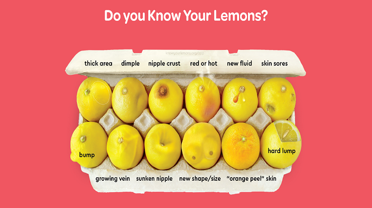
Another successful facet of the “Know Your Lemons” campaign is its simplicity. The infographics used in the “Know Your Lemons” campaign cut out a lot of extraneous information by conveying as much information as they can through visuals. The visuals themselves are simple as well. Without extra flourishes, the infographics convey information without providing distractions. The website is free of distracting background patterns and free of images with no educational impact.
Visual Metaphors
The most important piece of the “Know Your Lemons” campaign’s success is the use of visual metaphors. This campaign takes unfamiliar and complex changes in breast tissue and turns it into something familiar and simple: lemons. Many may know that changes in their breasts merit a trip to the doctor, but what if you don’t know what to look for? Every body is unique and it can be difficult to monitor gradual changes.
The “Know Your Lemons” campaign responds to these concerns through visual metaphor. While not everyone will know what breast changes may look like, everyone knows what a lemon looks like. This creates a standardized baseline (a typical, healthy lemon) that is easy to understand and inclusive of all people. Knowing what a typical lemon looks like allows you to quickly see how the lemons in the above infographic are atypical. By comparing the atypical lemons to the typical, we can also make this association with breast tissue.
The visual metaphors of “Know Your Lemons” are not only simple and relatable, but may also lead to a deeper understanding and consideration of the symptoms of breast cancer. Research shows that visual metaphors in health communications can lead to viewers thinking more critically about a message (Lazard et al., 2016). It is important to convey information for critical topics such as breast cancer clearly and in an impactful way, and visual metaphors can help make that impact.
The Power of Images
By using images to convey critical health information, the “Know Your Lemons” campaign overcomes several barriers to understanding, including human cognition. Our minds have limits to the information they can handle at one time (Artino Jr., 2008). The brain has a high capacity for visual processing, making it very quick and easy to interpret images (Otten et al., 2015). It is also easier to understand information when it is easier to access and organize that information; infographics allow information to be condensed, requiring less time to process and less mental resources (Spicer & Coleman, 2022).
The campaign’s images are at the forefront and are very explanatory on their own, but their website also contains some deeper text explanations. These explanations further viewers’ understanding of the elements which cannot be communicated through imagery. One example is differentiating between temporary marks made by tight clothes and the dimples experienced as a cancer symptom, as they may look similar. Because “Know Your Lemons” relies on images to communicate, we can focus much more on understanding the information presented.
Takeaways
There are many reasons why the “Know Your Lemons” campaign has been so successful, but the design behind the campaign has been a major influence. So, what lessons from the campaign can you use to bolster your own health campaigns? Here are a few takeaways:
- Don’t be afraid to be bold.
- Grab attention.
- Keep it simple.
- Be inclusive.
- Relate complex health topics to familiar ideas.
- Use images to cut down on textual information and simplify ideas.
Join us next Friday for the next post in our series: “How Qualitative Research Methods Supported the Successful “Truth” Anti-Tobacco Health Communication Campaign.”
For the full blog schedule, revisit the Series Introduction!
References
Artino Jr., A. R. (2008). Cognitive load theory and the role of learner experience: An abbreviated review for educational practitioners. AACE Review (Formerly AACE Journal), 16(4), 425–439. https://www.learntechlib.org/primary/p/25229/
Lazard, A. J., Bamgbade, B. A., Sontag, J. M., & Brown, C. (2016). Using visual metaphors in health messages: A strategy to increase effectiveness for mental illness communication. Journal of Health Communication, 21(12), 1260–1268. https://doi.org/10.1080/10810730.2016.1245374
Otten, J. J., Cheng, K., & Drewnowski, A. (2015). Infographics and public policy: Using data visualization to convey complex information. Health Affairs, 34(11), 1901–1907. https://doi.org/10.1377/hlthaff.2015.0642
Spicer, J. O., & Coleman, C. G. (2022). Creating effective infographics and visual abstracts to disseminate research and facilitate medical education on social media. Clinical Infectious Diseases, 74(Supplement 3), e14–e22. https://doi.org/10.1093/cid/ciac058
Tractinsky, N., Cokhavi, A., Kirschenbaum, M., & Sharfi, T. (2006). Evaluating the consistency of immediate aesthetic perceptions of web pages. International Journal of Human-Computer Studies, 64(11), 1071–1083. https://doi.org/10.1016/j.ijhcs.2006.06.009


